
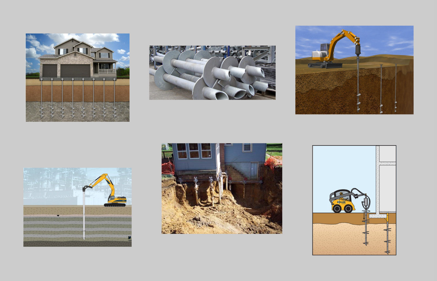
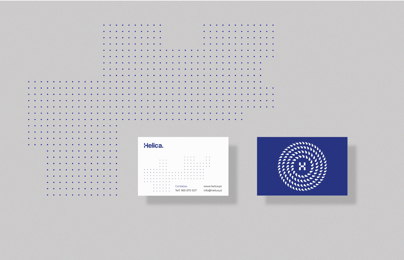
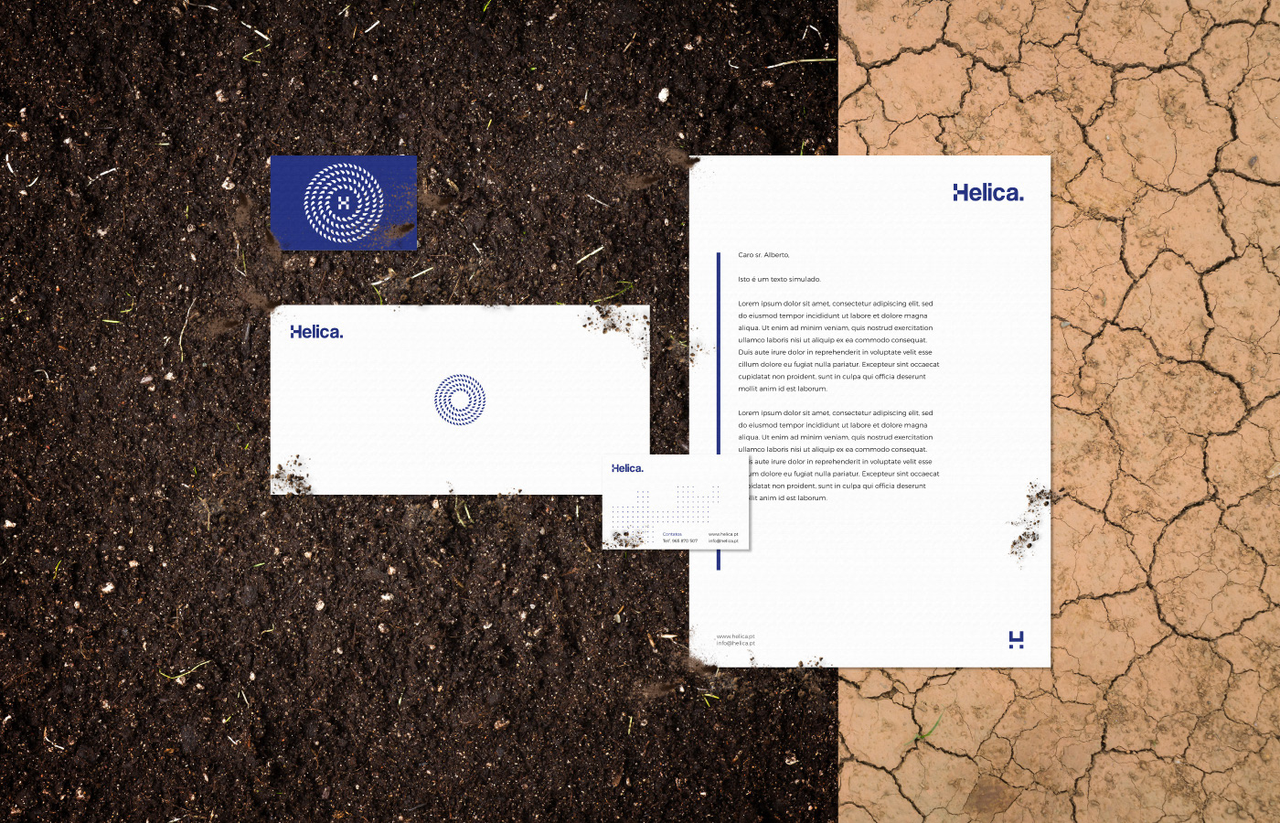
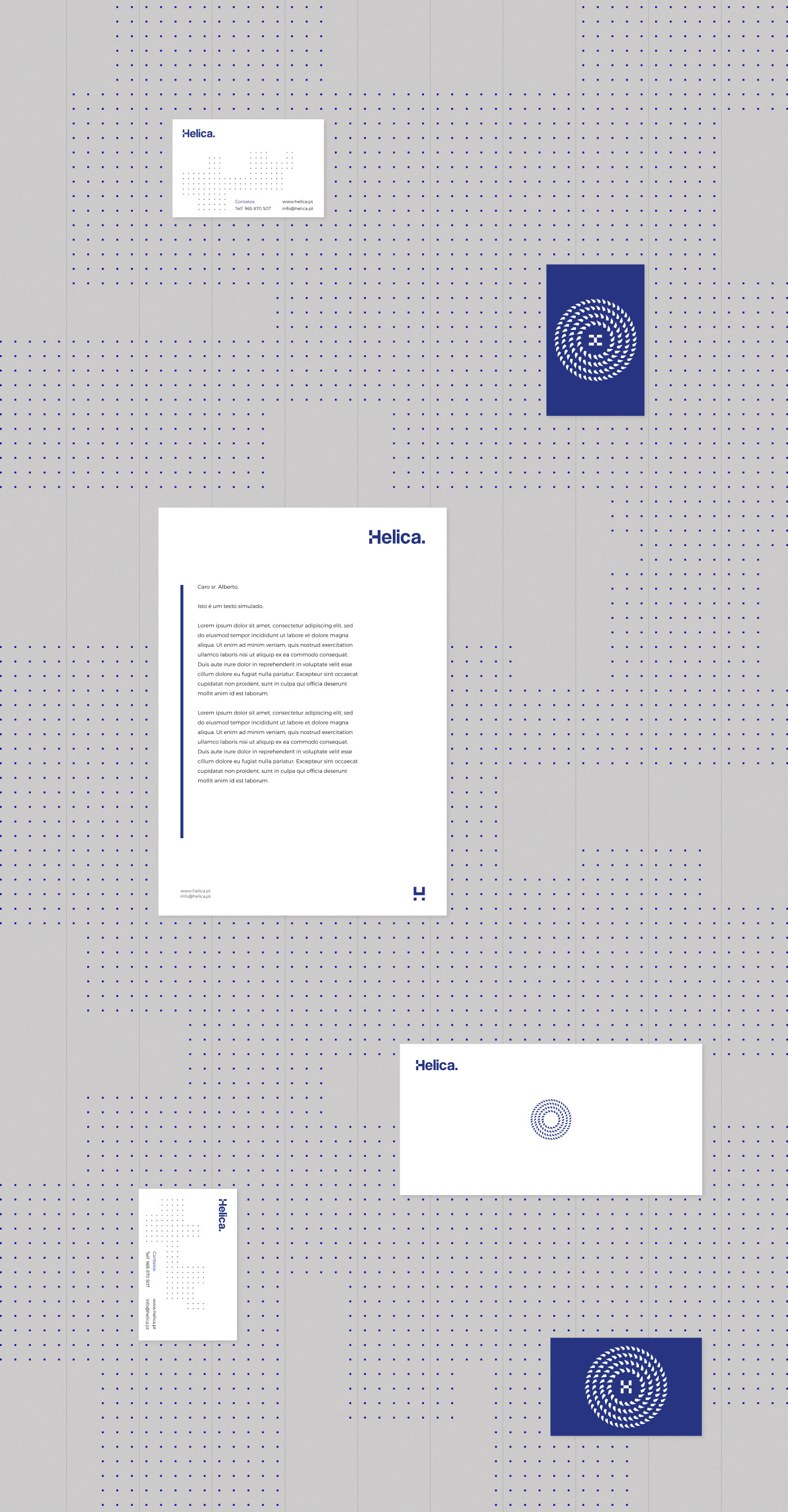
The graphical representation of the helical pile/pipe suggests rotational movement, high-tech and engineering.

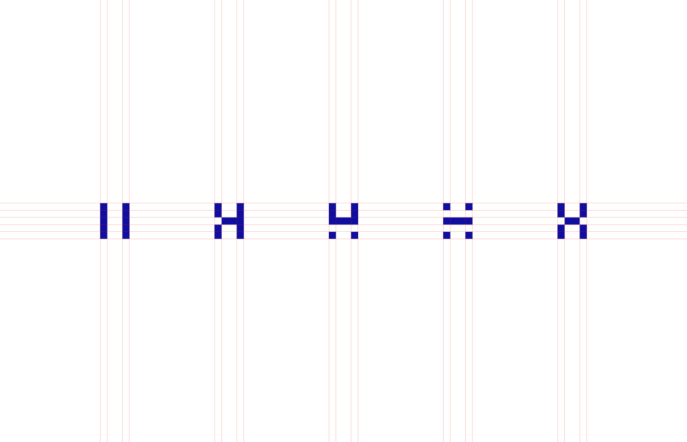
The modern and simple wordmark communicates commitment, balance and confidence.
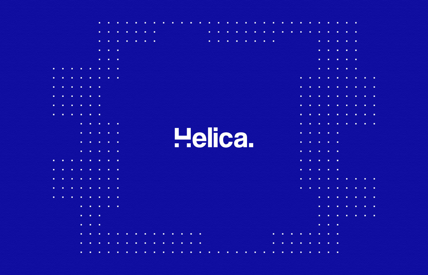
Various symbols were developed from the silent letter "H", as a way to communicate operational areas/places, always keeping the resemblace of the letter "H".
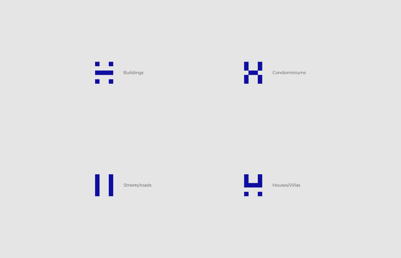
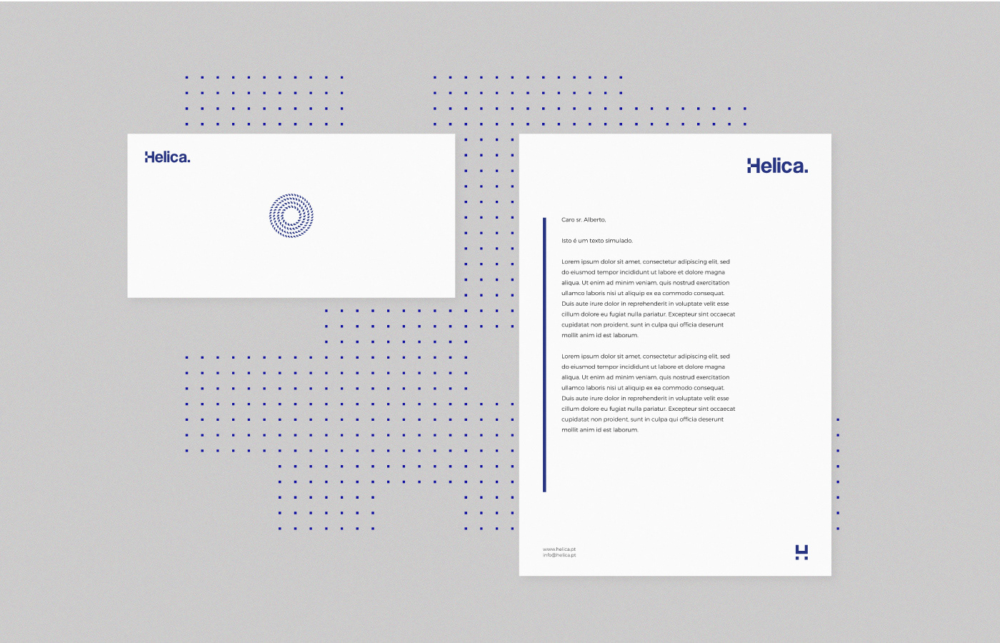
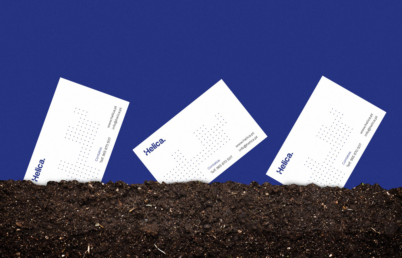
The little dots/squares refers to the top view of a plant/area where Helica can operate.
No matter how large the area is, Helica has the solution.
No matter how large the area is, Helica has the solution.

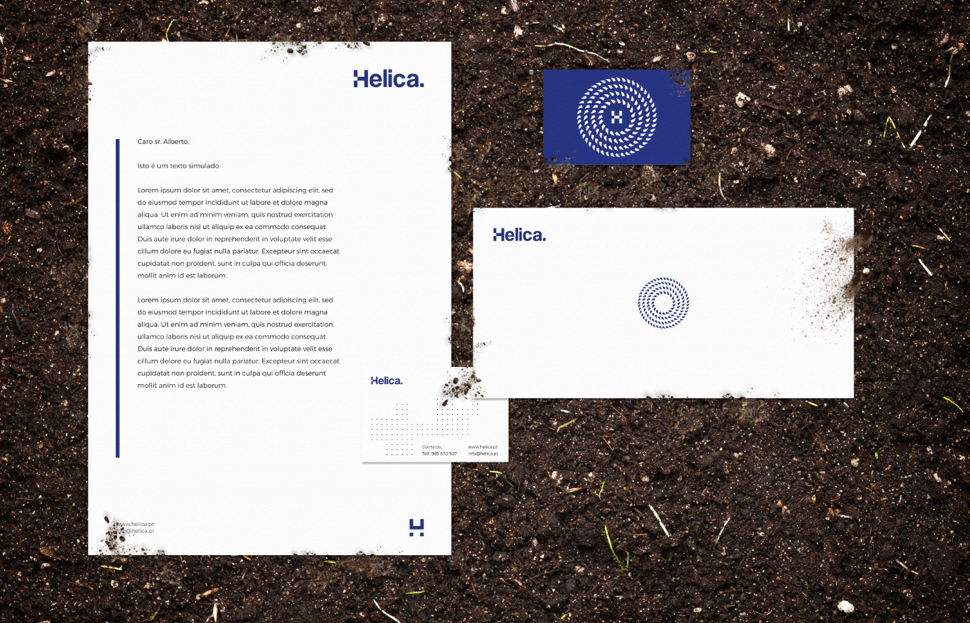
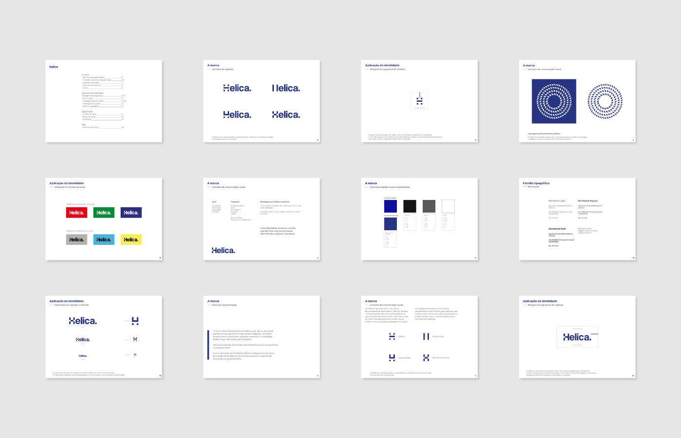
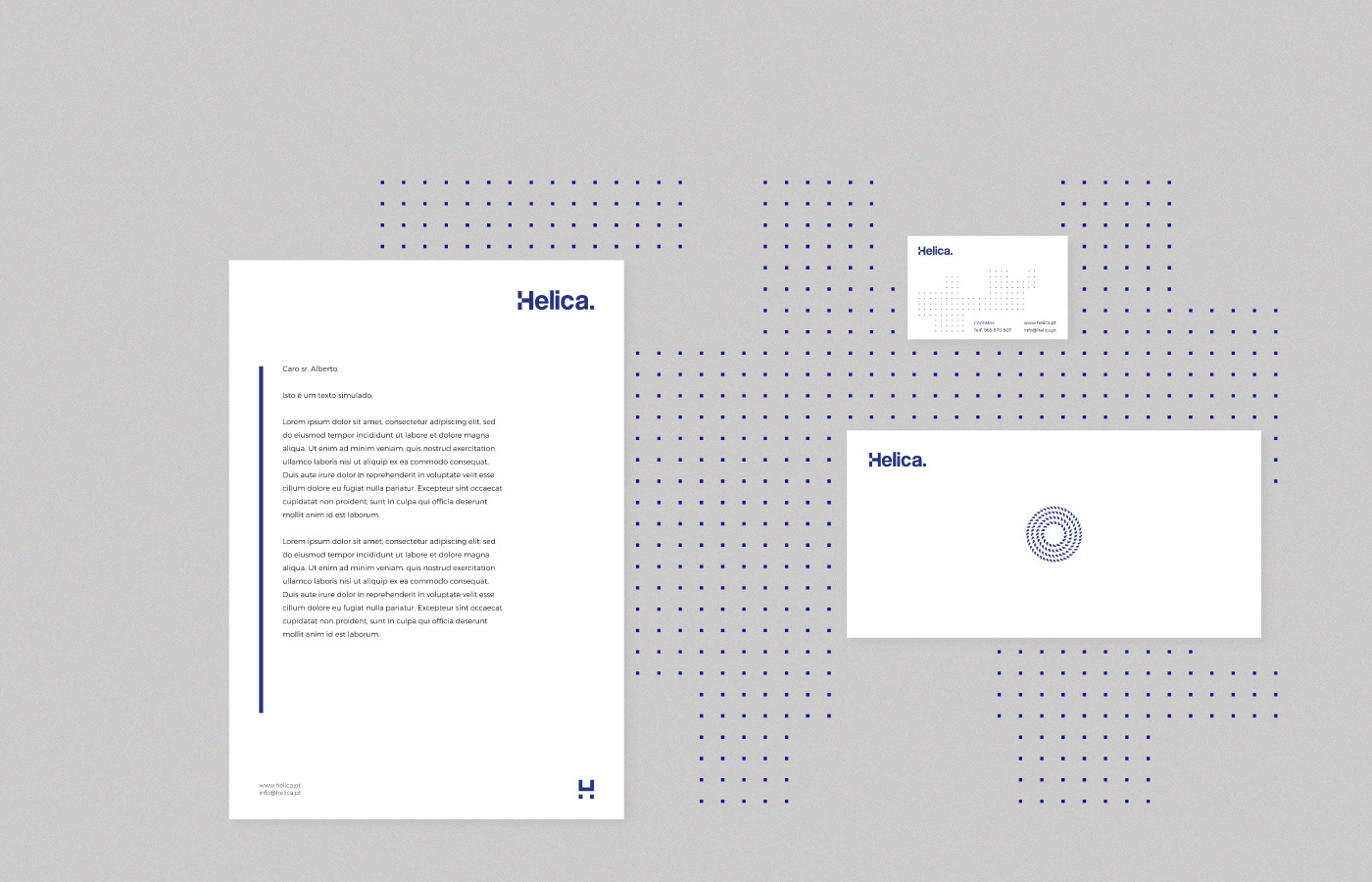
Brandbook guidelines


E-mail signature
Brand design and UI/UX by Pedro Almeida / pedrobrands.com
Web Development by Cristiano Almeida / csalmeida.com