


Featured in the DIELINE
Credits:
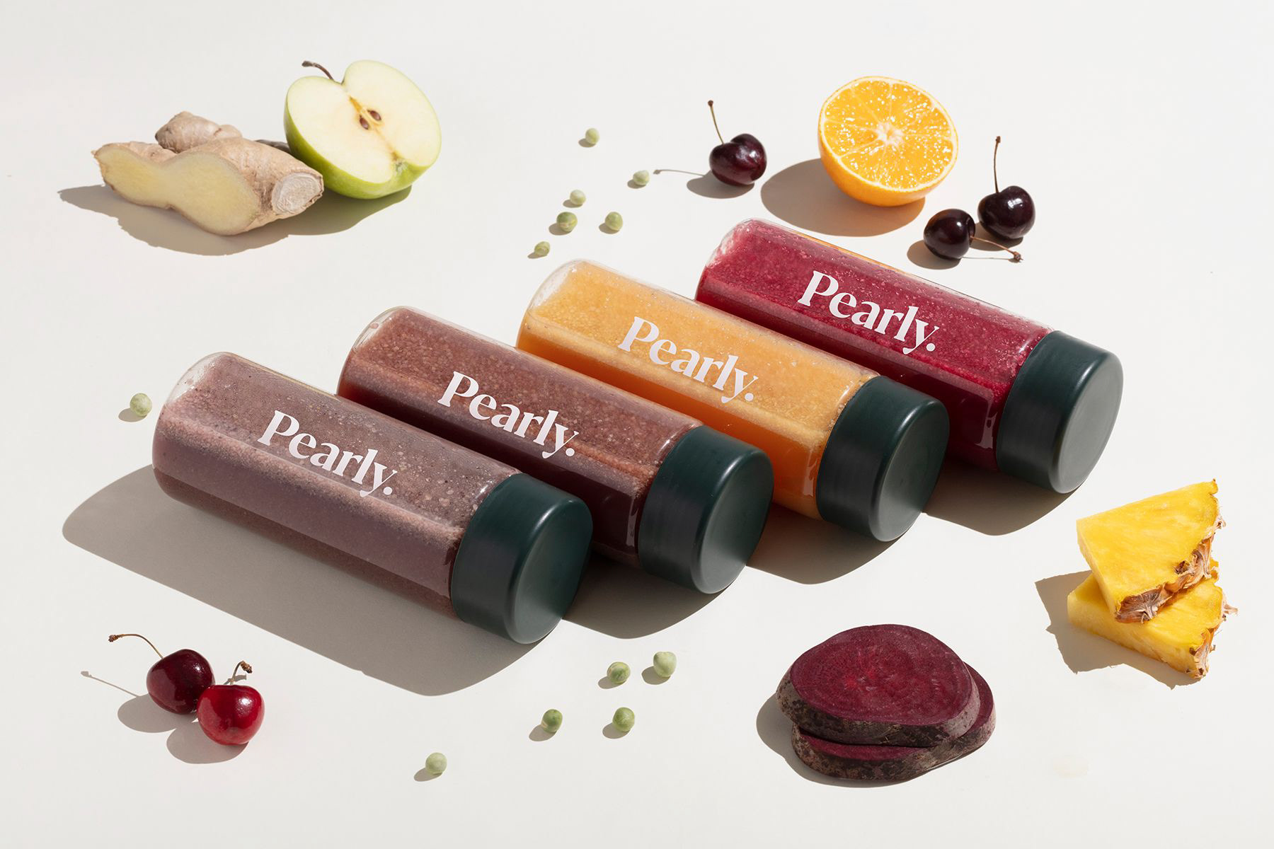
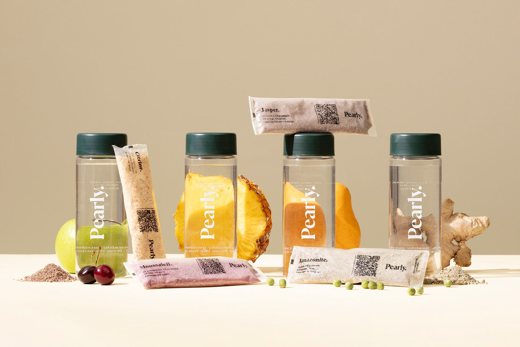
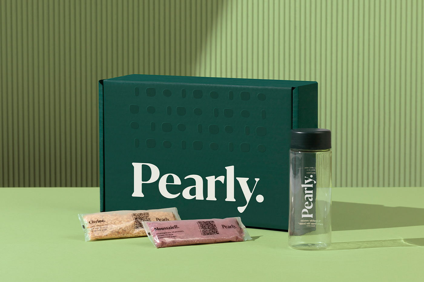
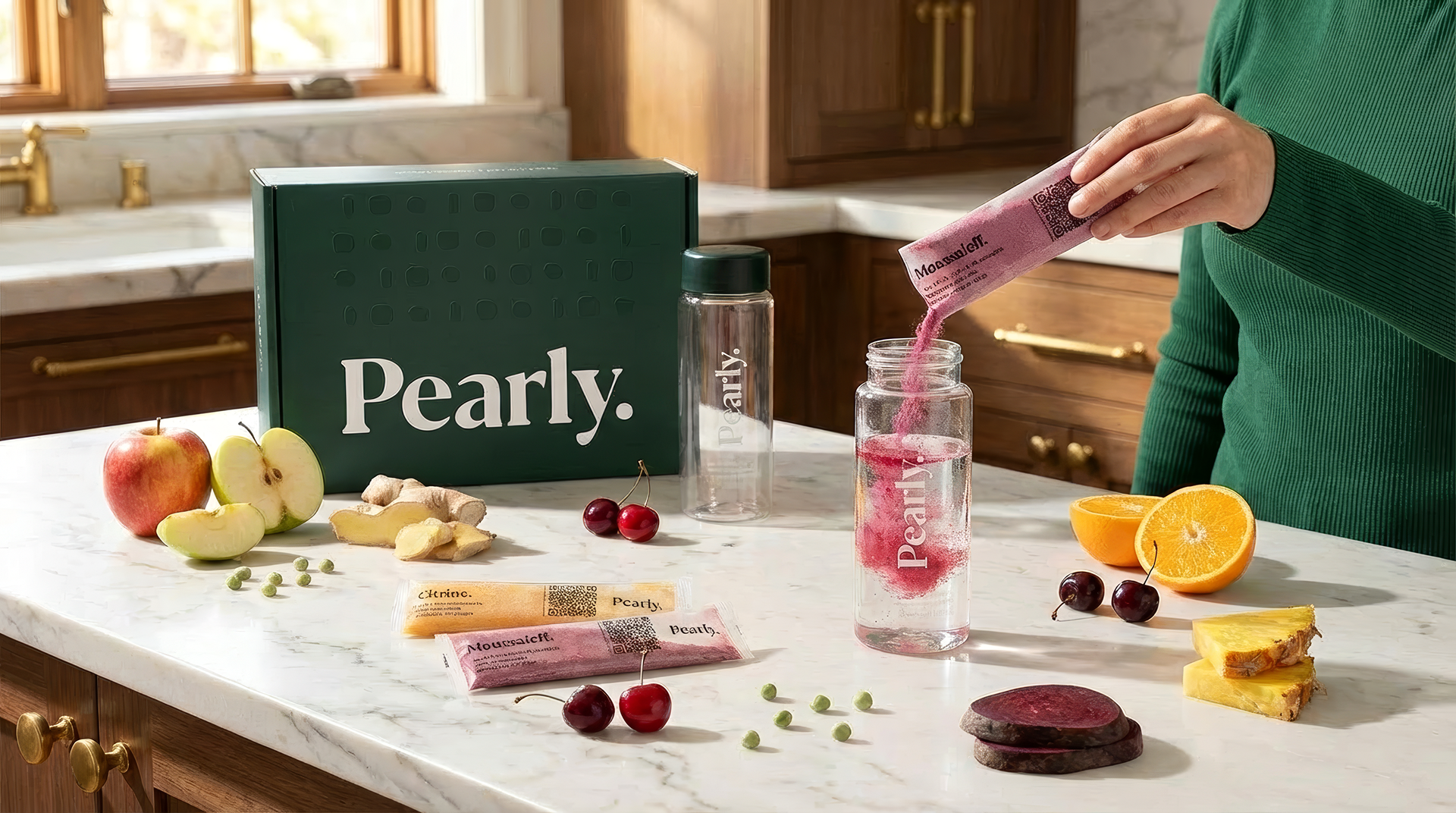
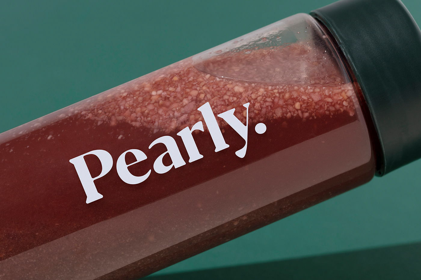
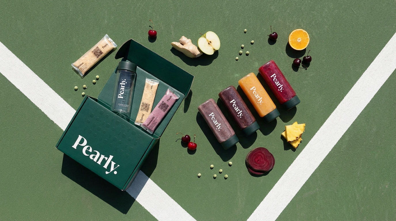
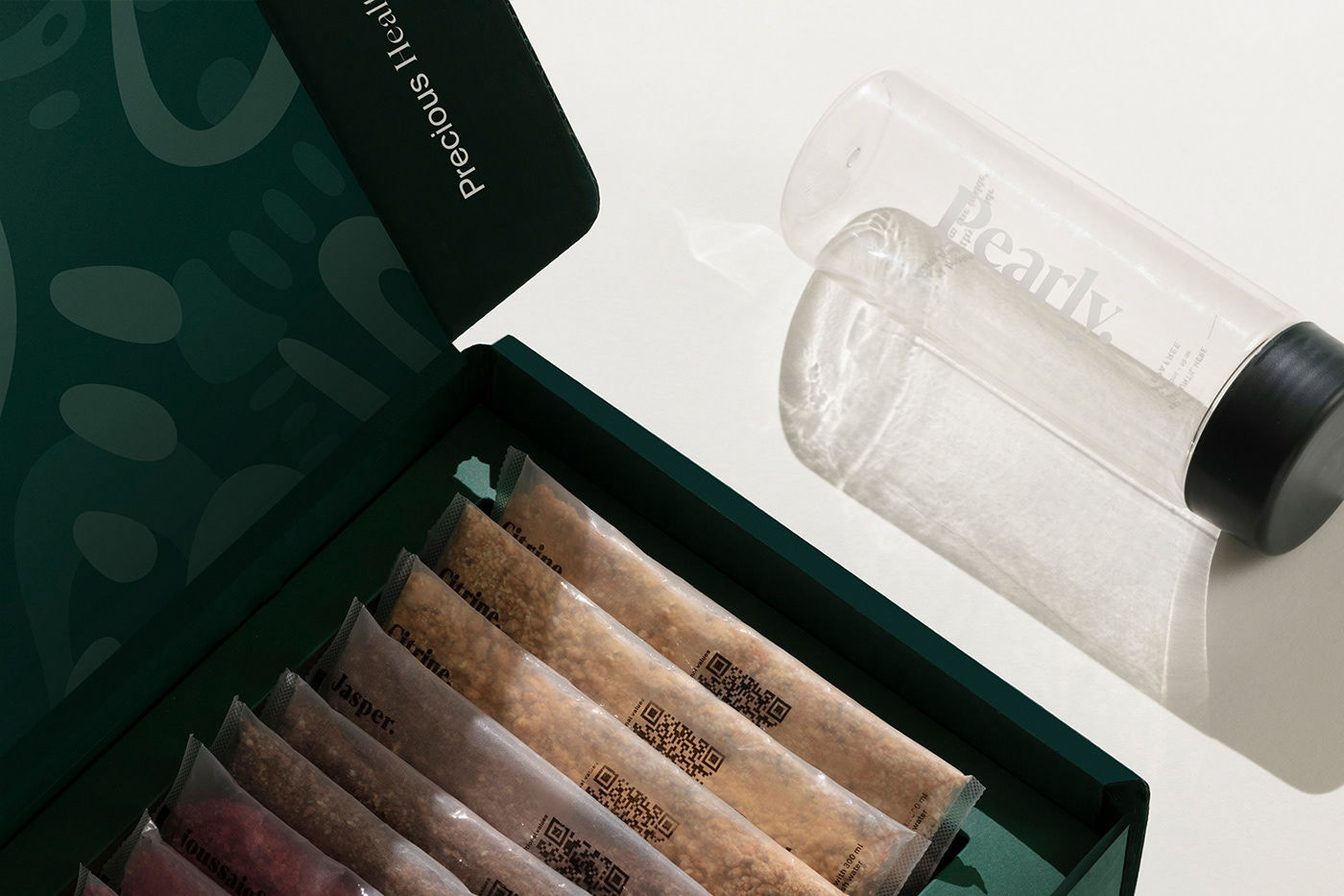
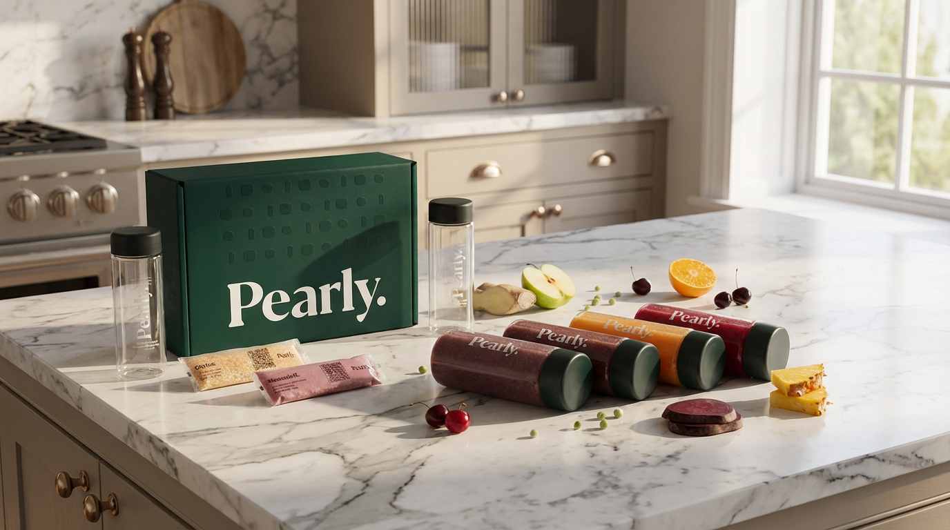
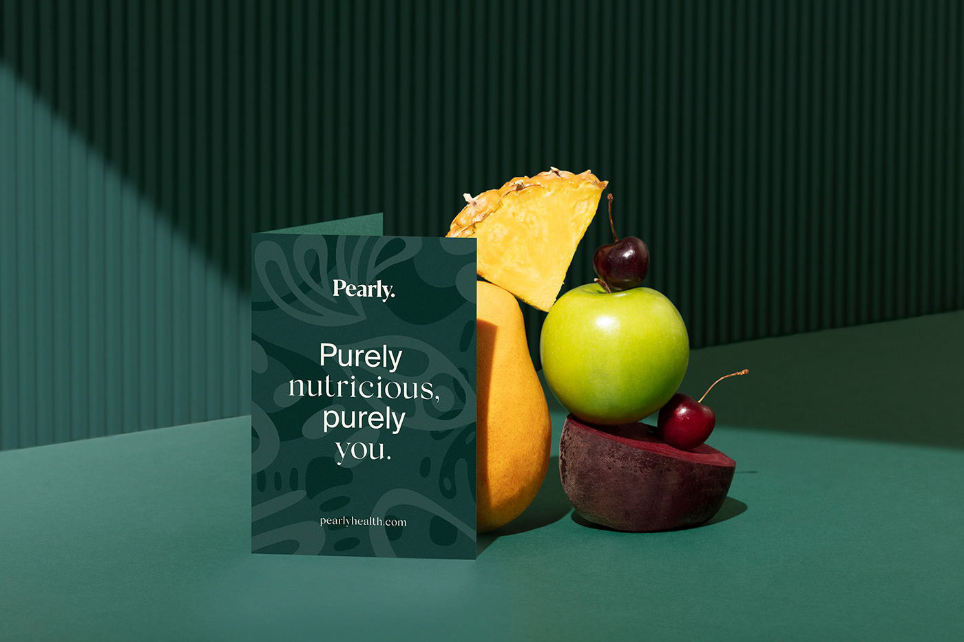
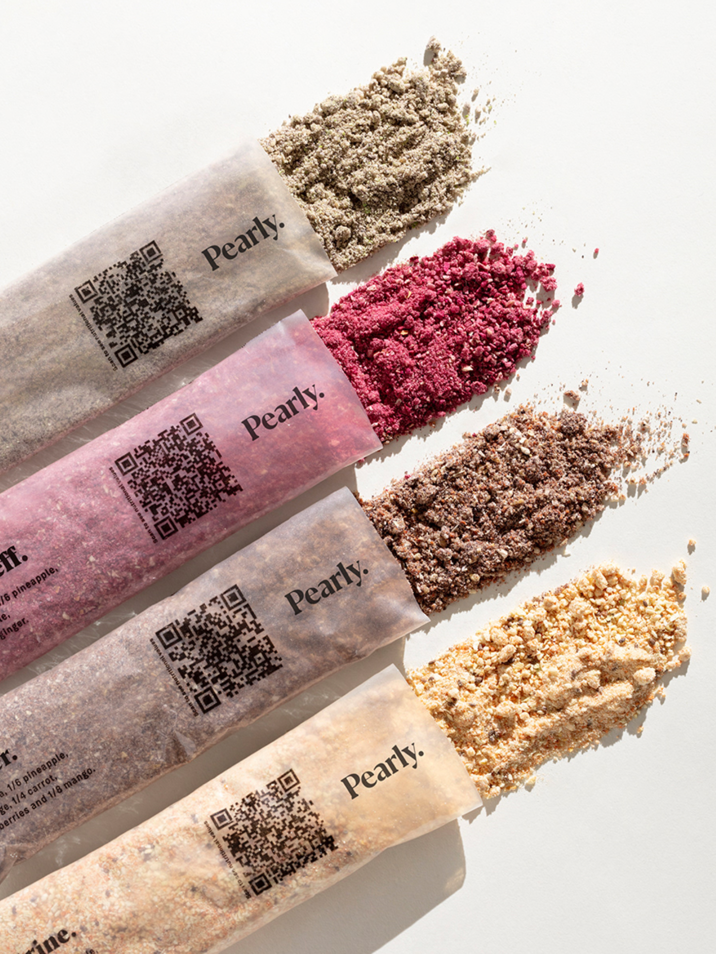
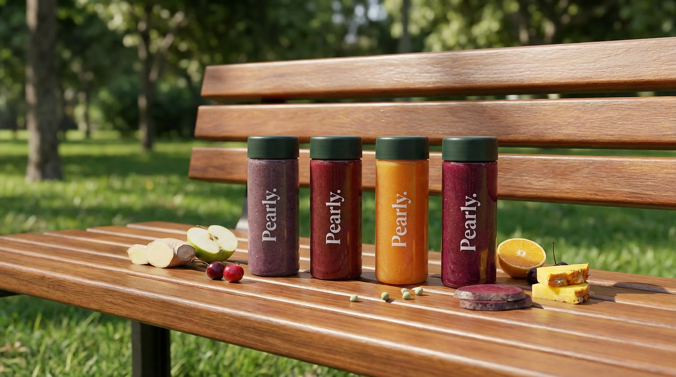
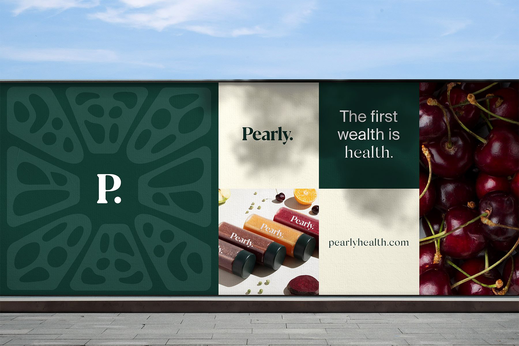
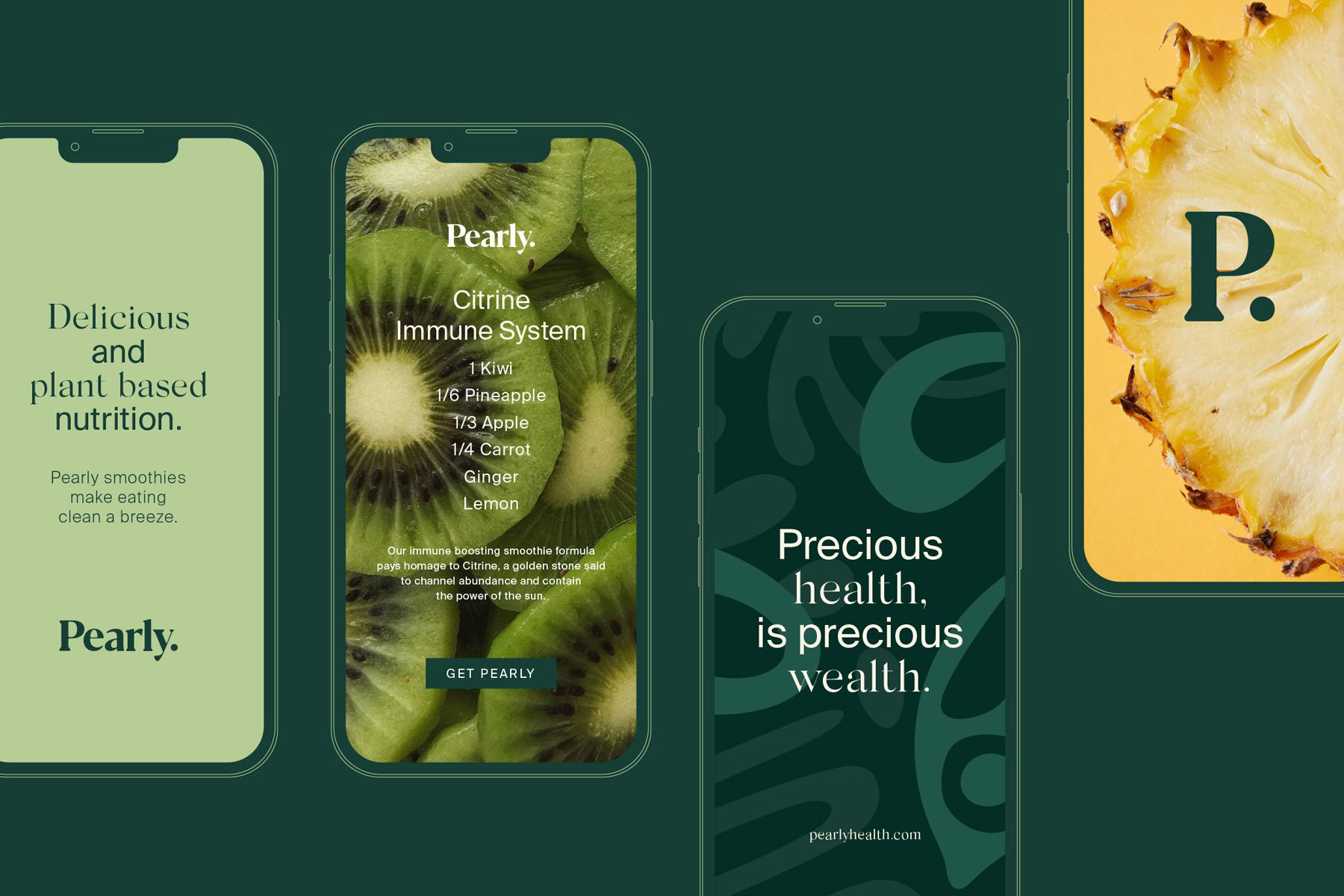
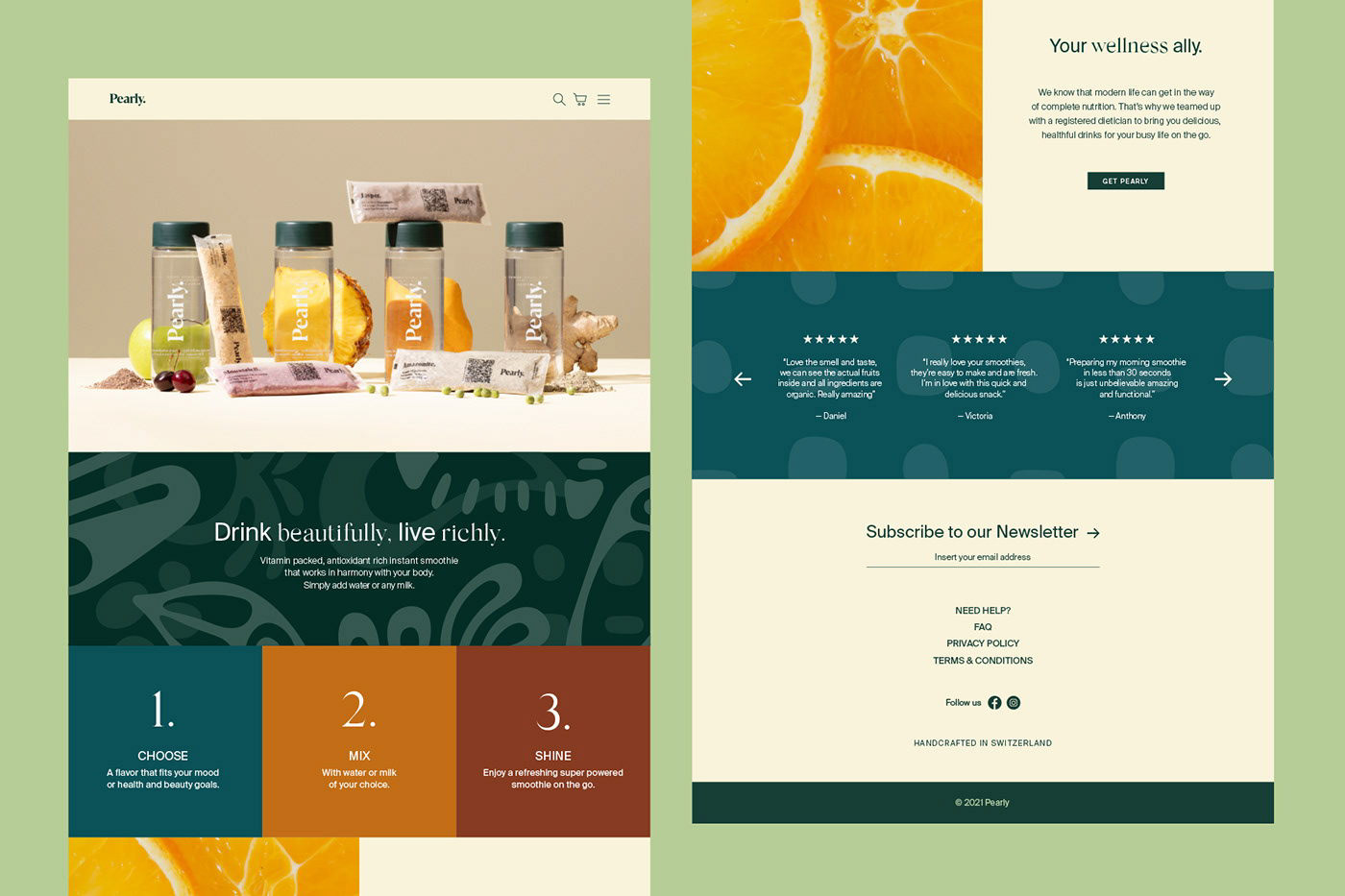
Client: Pearly.
Brand strategy and positioning: Pedro Fonseca Almeida
Visual identity development: the branding people and Pedro Fonseca Almeida
Packagings: the branding people and Pedro Fonseca Almeida
Photography: the branding people
UX/UI: the branding people
Front and back end development: Daniel Oliveira and Nuno Marques