
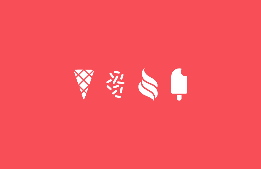
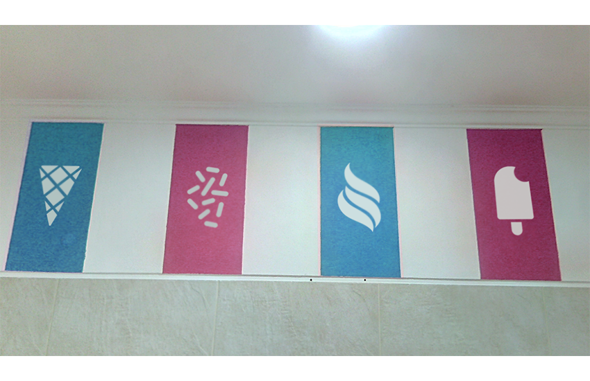
Illustrations/icons to represent the brand visual communication of the store.

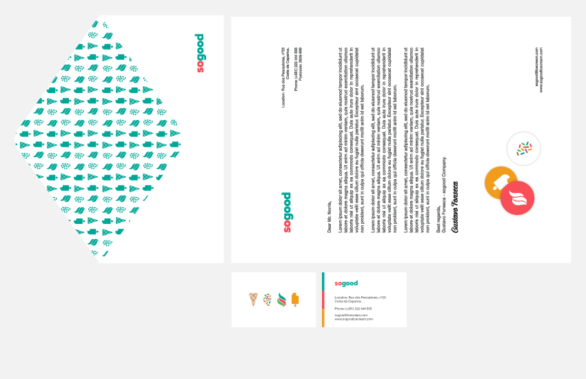
Envelopes


Pins

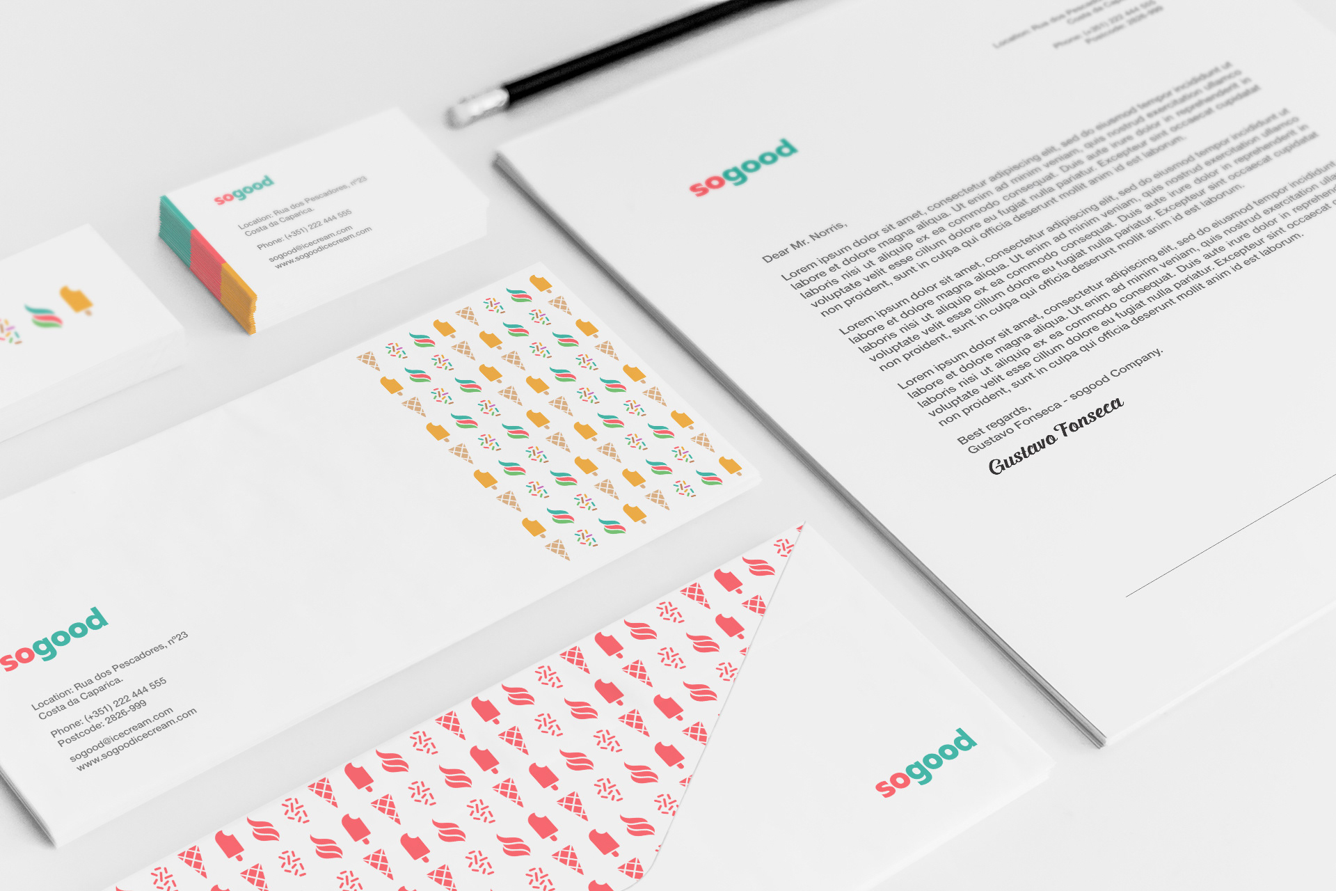
Stationary


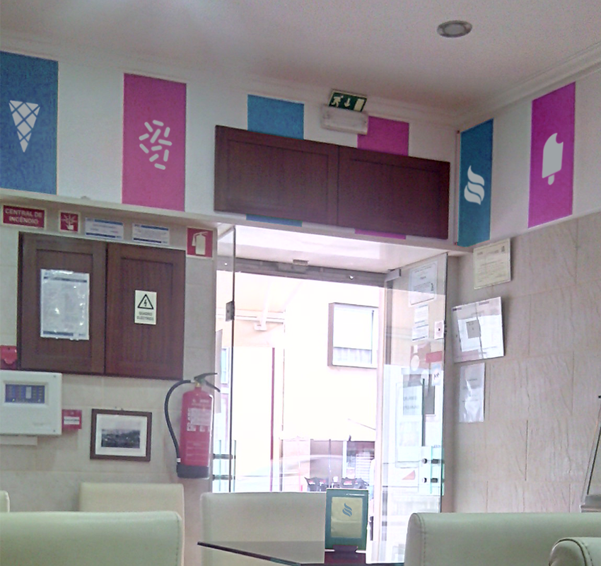
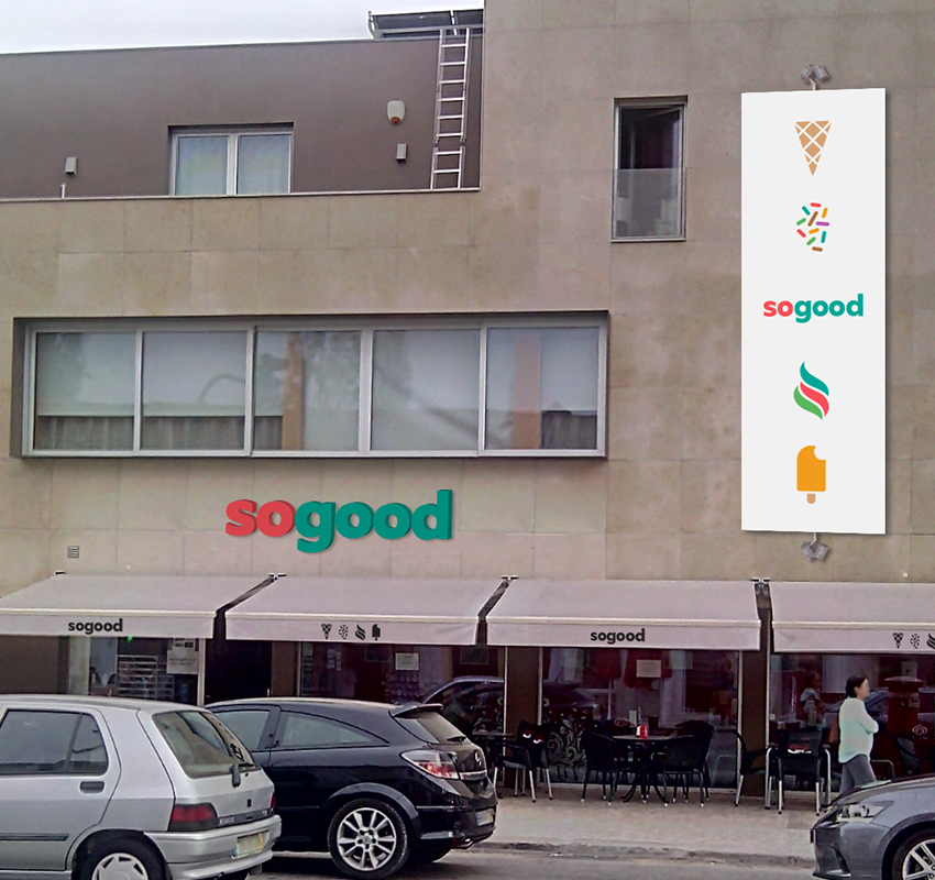
Boutique (interior)

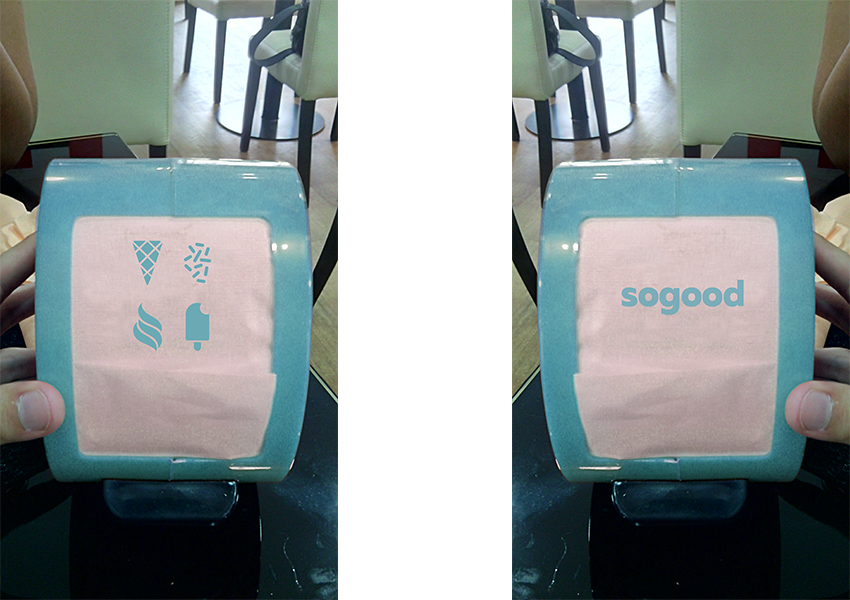
Napkins

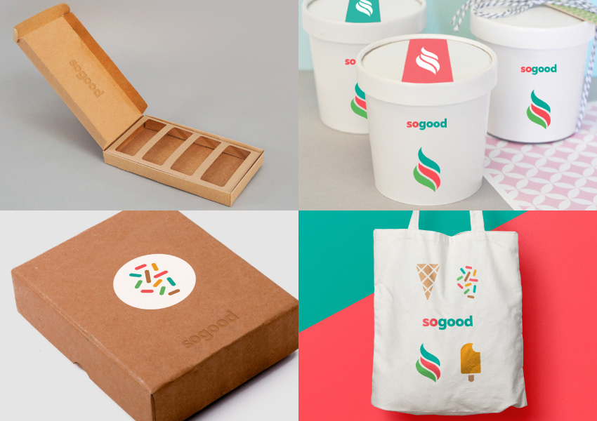
Take away packaging for each product.
Packaging design was only used for presentation purpose and belong to their owners.
Boutique (exterior)

Pantones colors

Pattern

The ugly sketches but important creative process.

Illustrations with different style/lines.

Playing with the brand elements of toppings.